
Brand project · 02
Light Threads
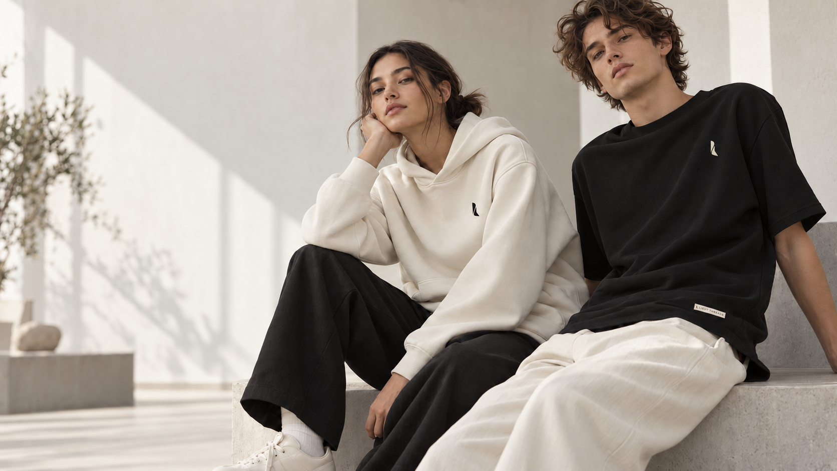
The creative choice
Create a brand people want to wear before they even read its story.
Light Threads needed to stand out without shouting. We built a restrained, tactile and precise language in which black, ivory and cobalt blue allow the clothing to lead.
The symbol acts as a discreet signature. The more expansive name builds recognition and gives the young brand an immediately identifiable presence.

A clothing brand is not judged on a technical sheet. It is recognised through cut, material and detail.
The collection
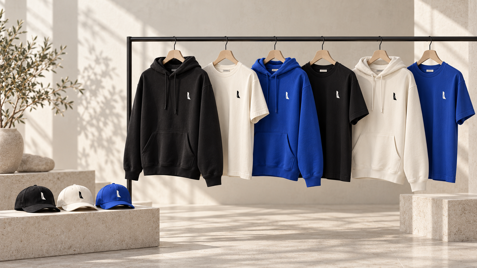
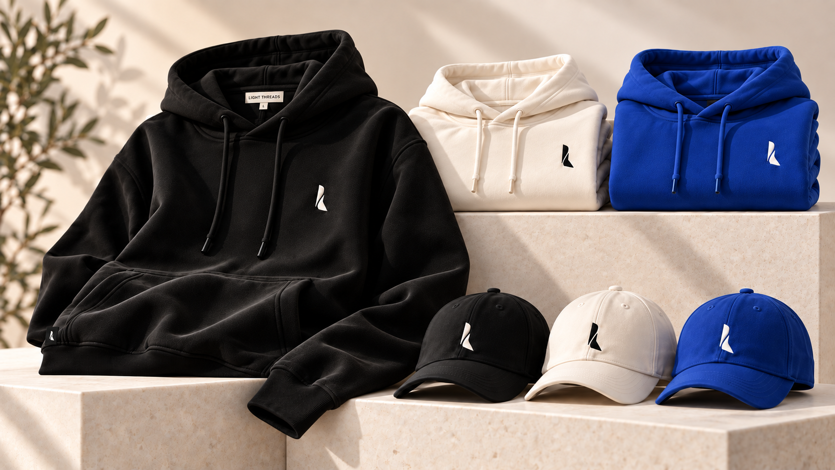
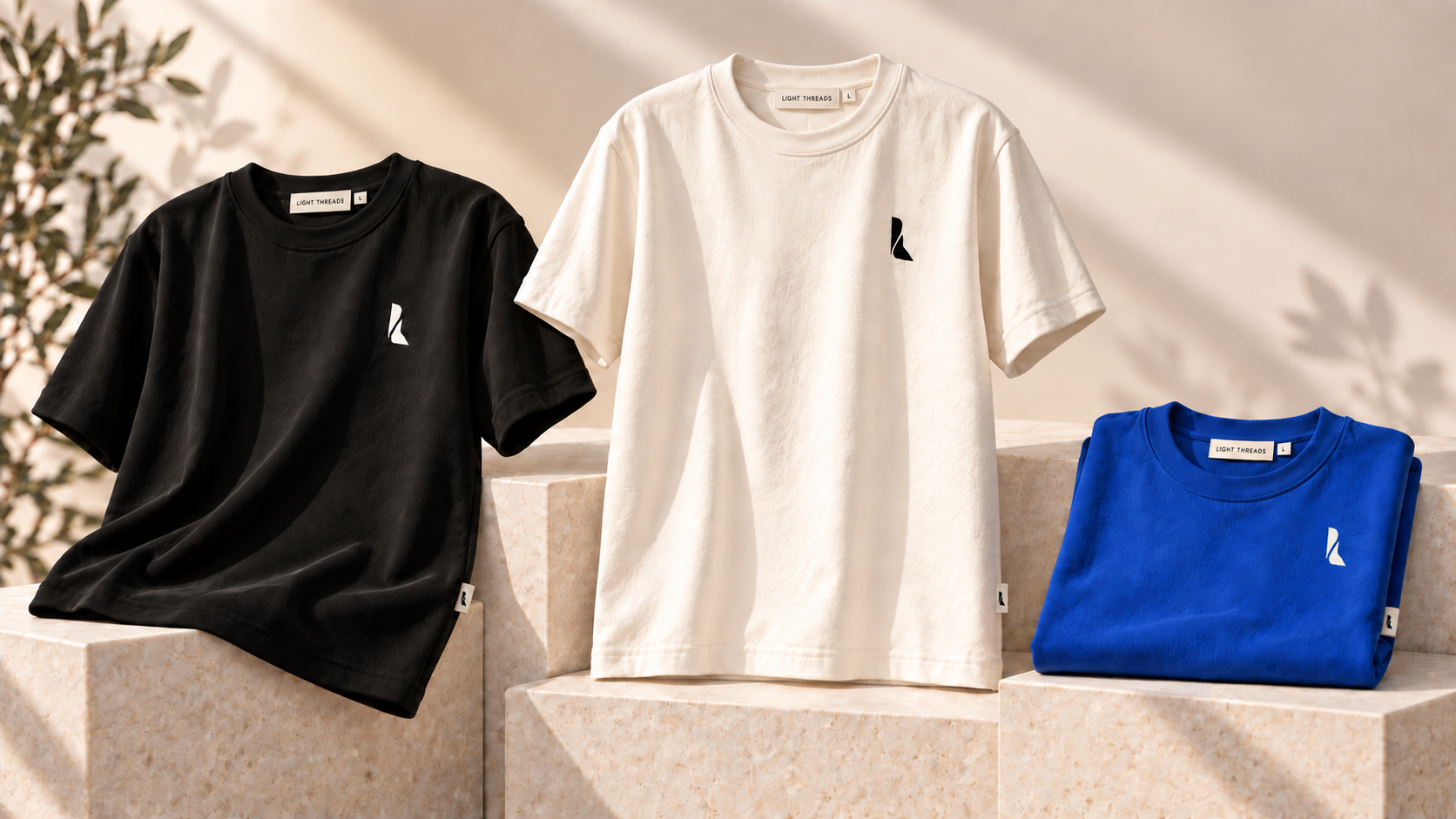
One visual language across every piece, without redesigning the logo for each application.
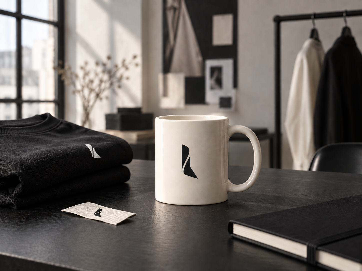
The palette creates contrast; embroidery, neck labels and hem tags provide continuity. The system remains recognisable on a T-shirt, hoodie or cap, whether the piece is worn, hung or folded.
The experience
The brand continues after the garment is chosen.
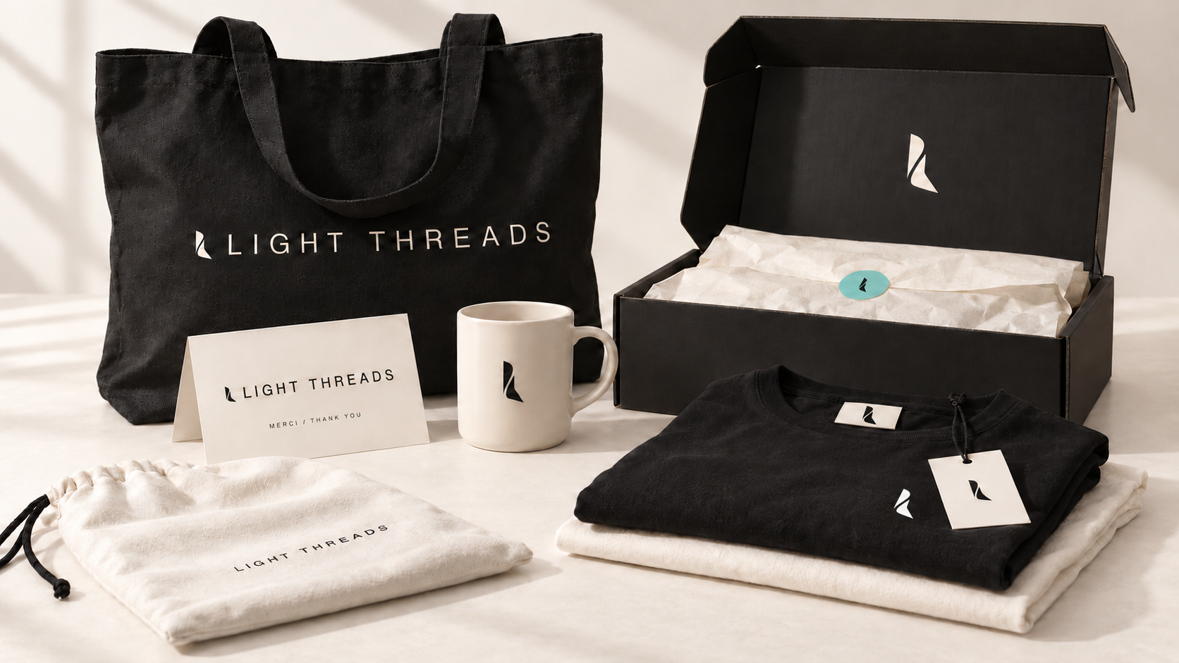
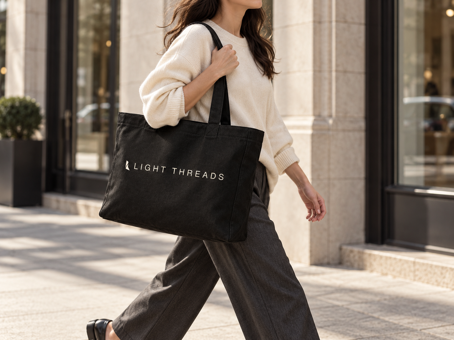
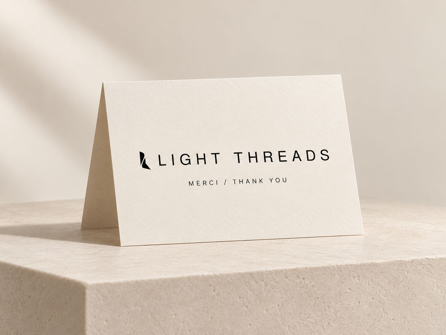
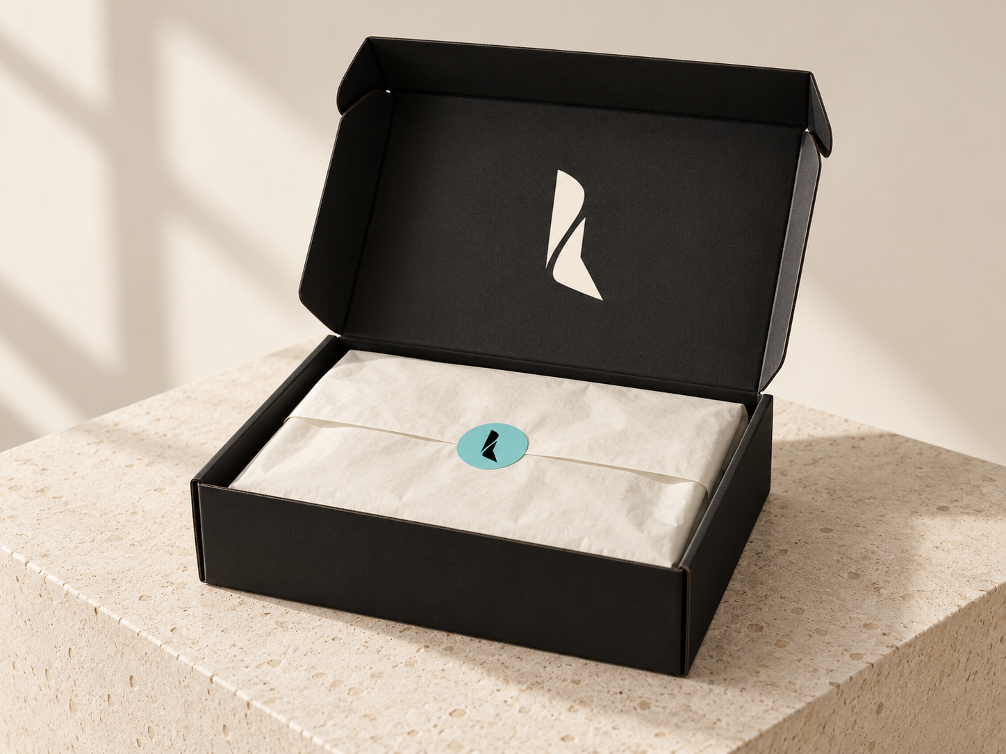
The tote, mug, thank-you card and packaging extend the same world. Every touchpoint enters at a precise moment, while the symbol and wordmark continue to be used with restraint.
04 · Public deployment
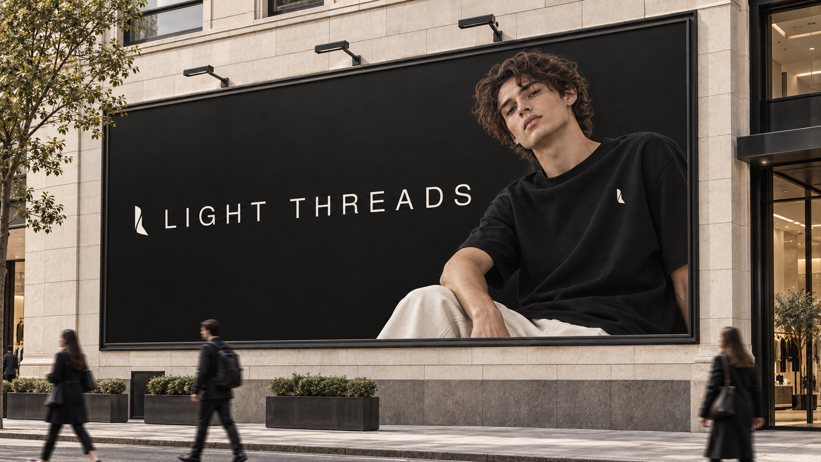
An identity designed to be recognised at the scale of the city.
The banner carries the same system into public space: the garment leads the image while the wordmark remains legible from a distance.
Outcome
An identity ready to live across a collection.
Light Threads now has a coherent world, a recognisable mark and a system flexible enough to move from garment to label, then from campaign imagery to digital without losing its character.
Your project